Camden Eats is a Click & Collect Platform creating a superior takeaway experience for its users, it’s London’s largest marketplace app with 170 restaurants live.
Founded in 2016, the app allows users to order from central London food retailers from their mobile device, it now includes group ordering, rewards and a benefit scheme.
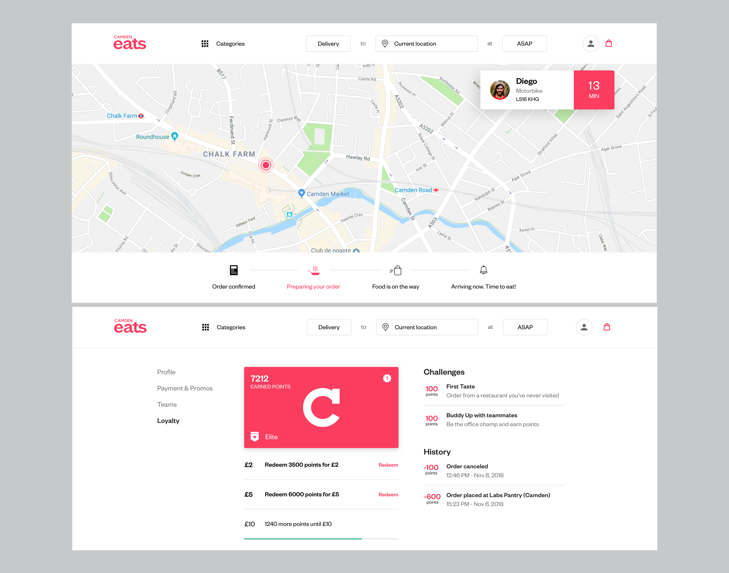
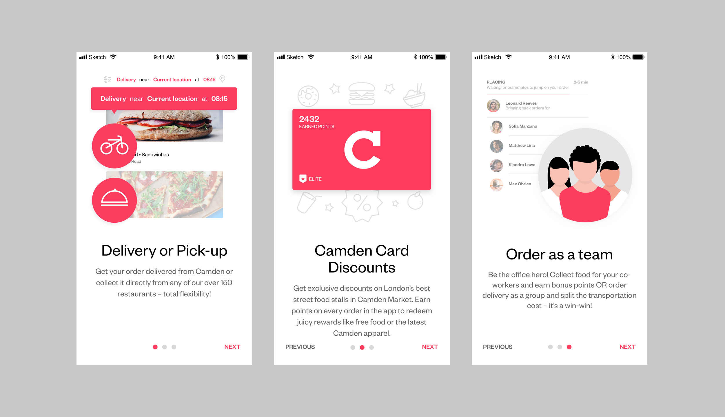
Collect points every time you place an order on Camden Eats and use them to buy food and drinks at any partner restaurant on the app
Redeem 3,500 points for £2, 6,000 for £5 or 10,000 for £10 and use your reward at the store of your choice
Place 8 orders per calendar month to unlock & maintain Elite status, which gives you 2x points on every purchase!
Complete the challenges to earn bonus points and redeem points for Camden Eats Pounds even quicker!
For every £2 you spend, you collect 10 bonus points
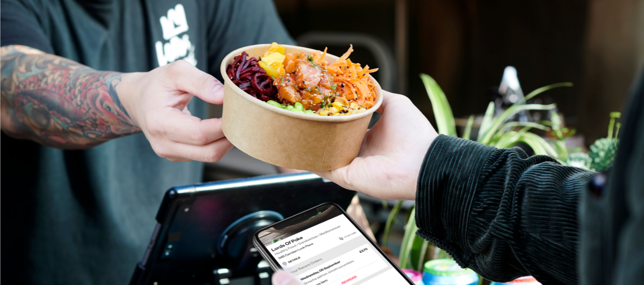
The founders got in touch with me with the proposition to help them rebrand their food ordering business, in order to attract even more userbase and potentially create a successful exit.
For this project I was responsible with expanding their product design, creating and simplifying features that will make the team ordering experience a lot easier and rewarding.
Besides the desktop and mobile ordering app I was also in responsible with creation of two new provider landing pages.
I led the product design together with the project manager who would also act as a voice between stakeholders and the development team which consisted of 4 developers, 1 iOS, 1 Android, 1 Back-end and 1 Front-end.
My role needed to output a complete redesign of the app, partner & stakeholder presentations, content strategy and a whole range of marketing materials, stands, stickers, brochures, menus and packaging.
Camden Eats needed a revamp in order to extend it’s reach and attract more attention. In order to maintain it’s position in the market the app now features scheduled delivery, new award system and a fresh face.
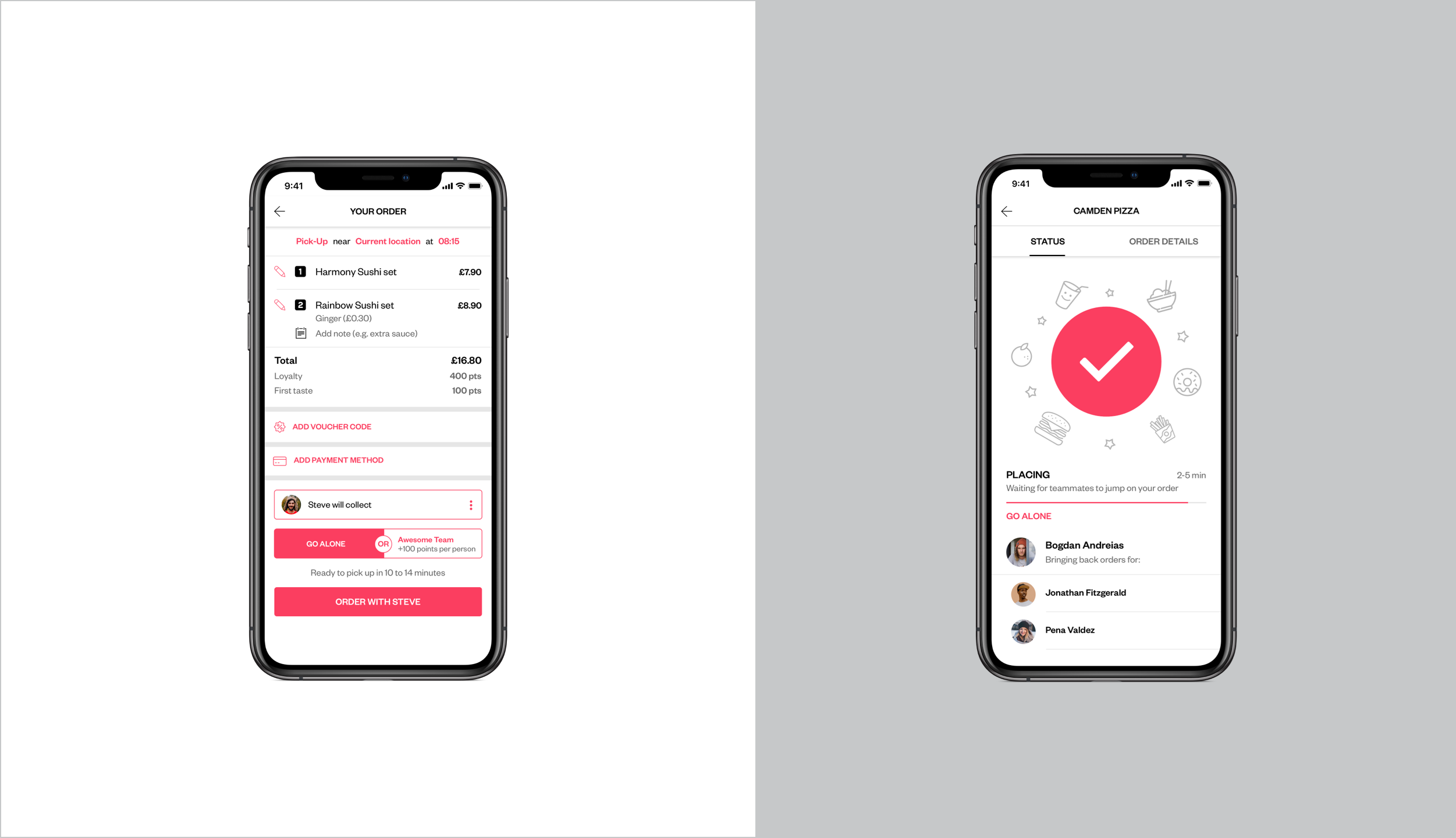
New design requirements also had technical implications that led to more engineering requirements. Competitive analysis positioned delivery scheduling as a key feature on the roadmap.
Consistency, delivery scheduling, streamlined benefit scheme process are just a few of the objectives sketched out in order to meet business and customer goals.
My findings pointed out both graphic elements and terminology that should be consistent across the app. Minimize cognitive load by maintaining task-relevant information within the display.
Our challenge was to polish the mvp, enhance the ordering experience and broaden the audience through the use of design and opportunities.
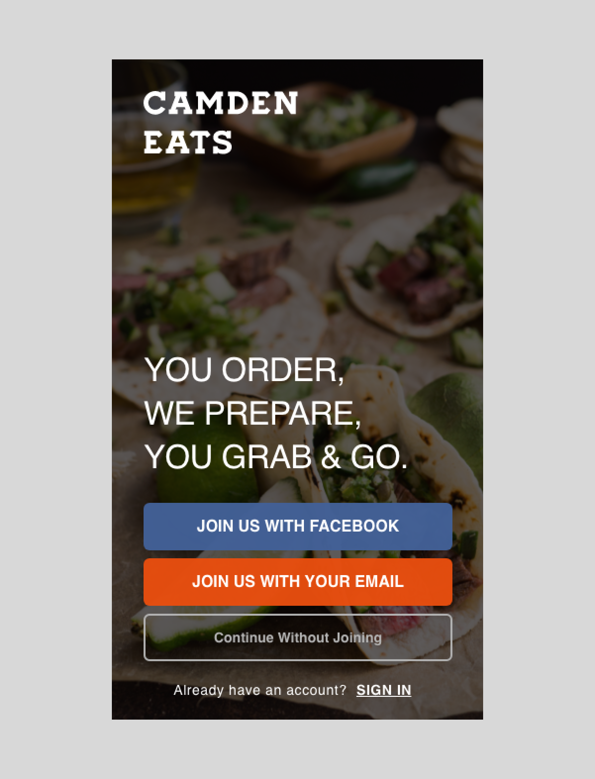
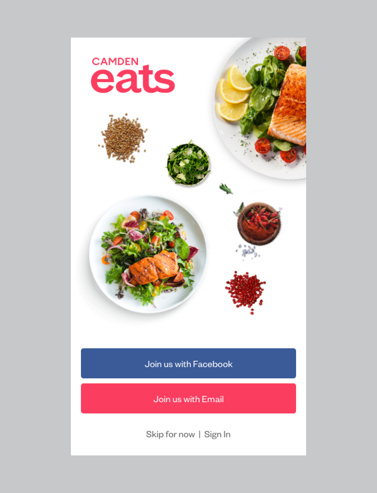
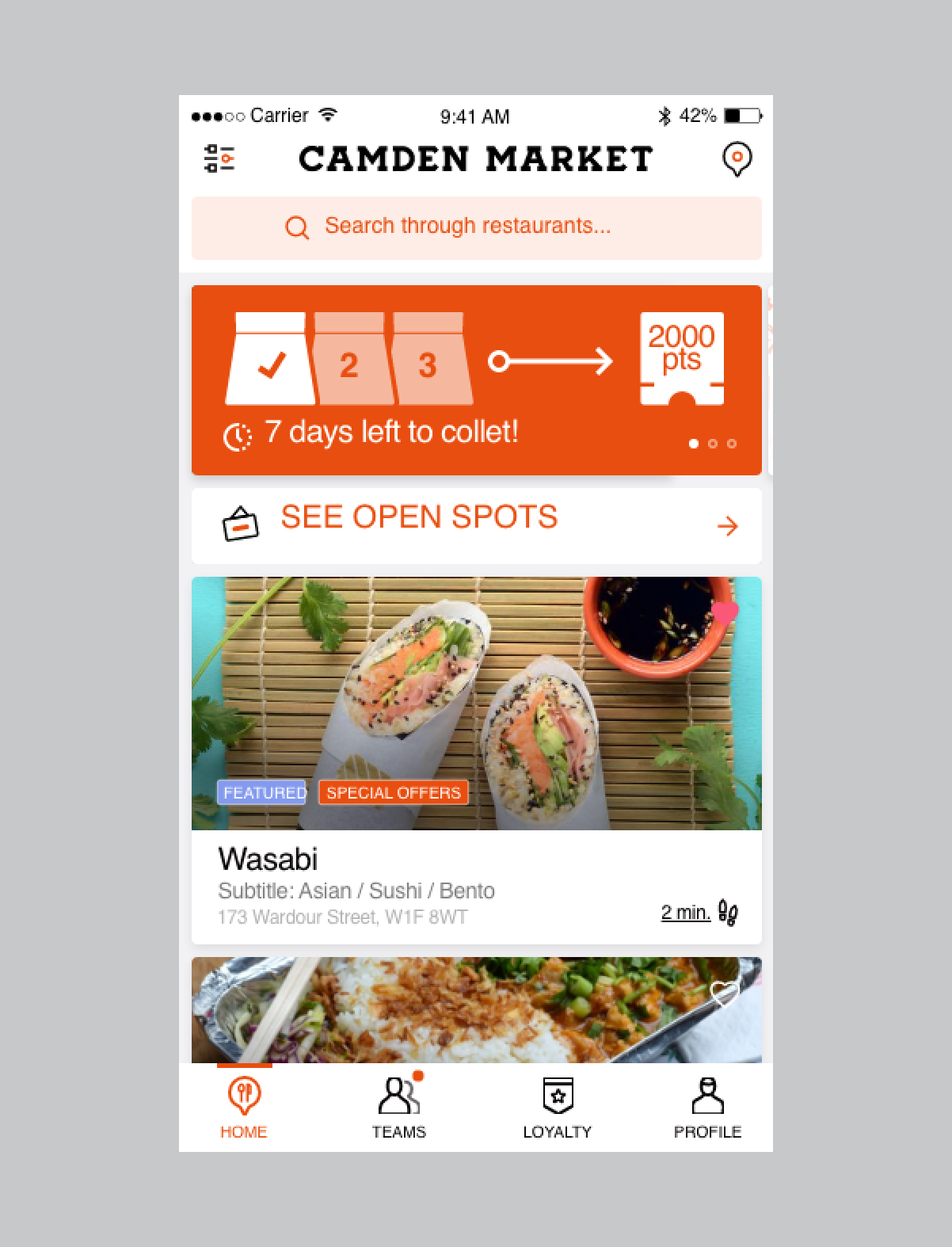
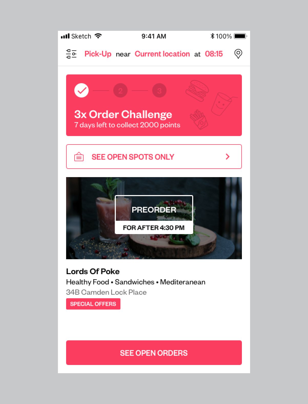
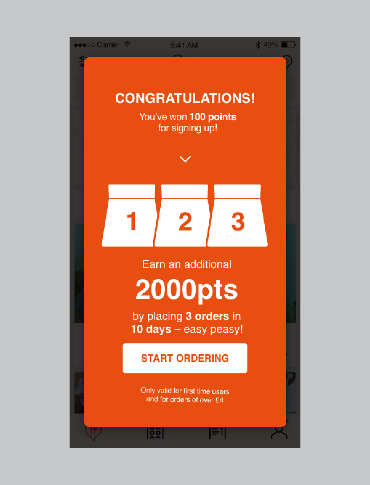
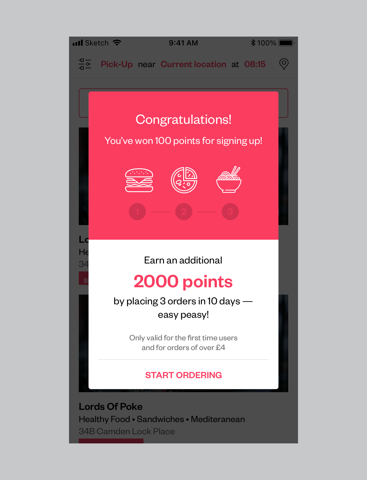
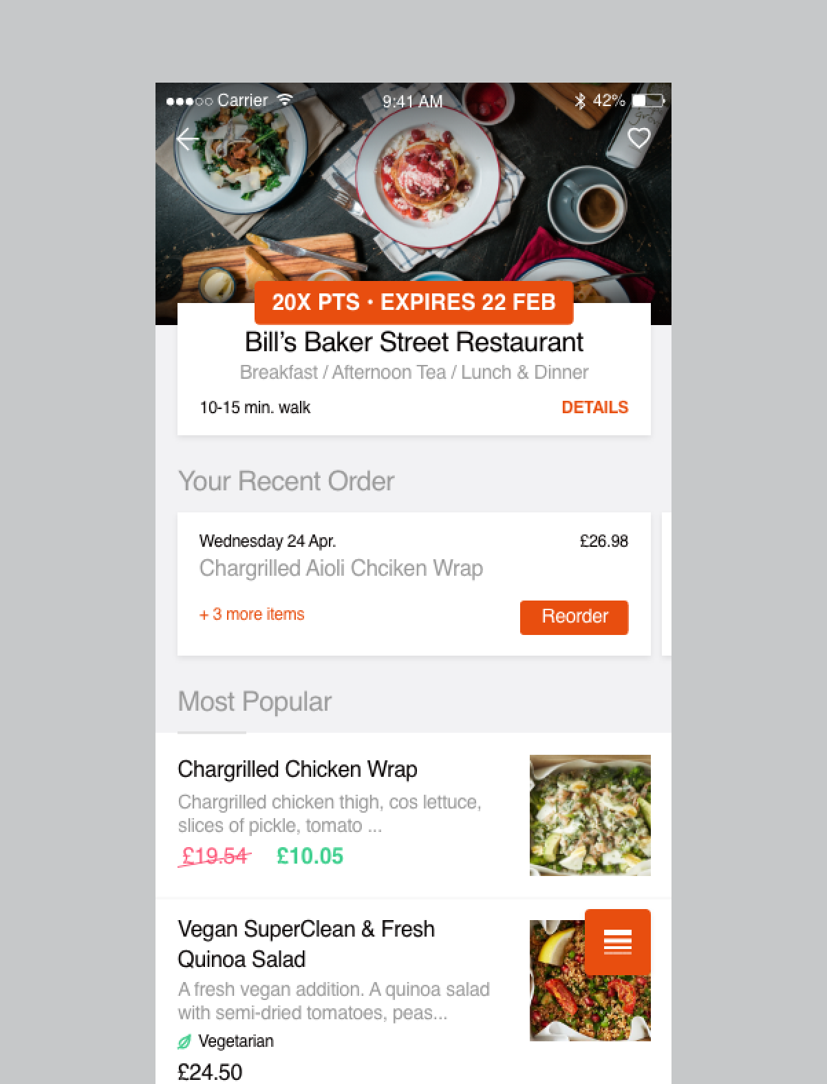
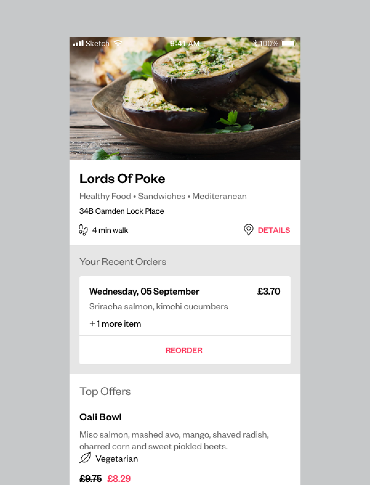
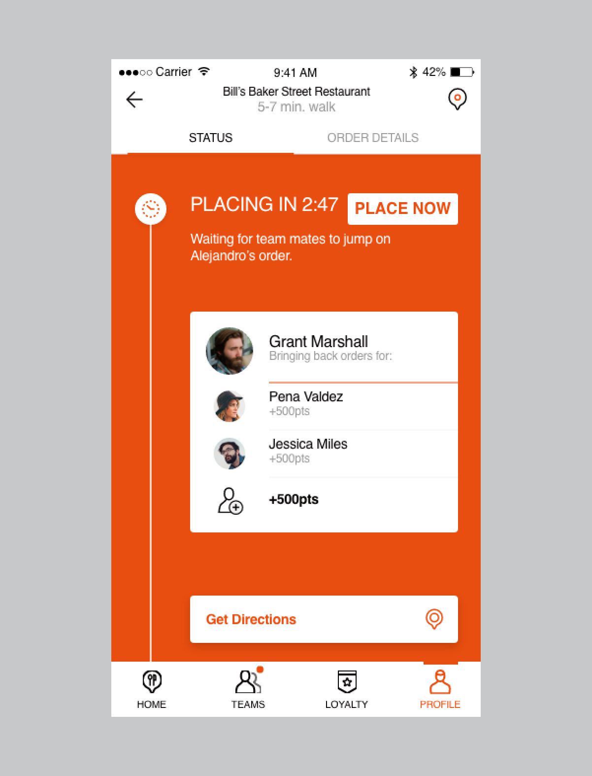
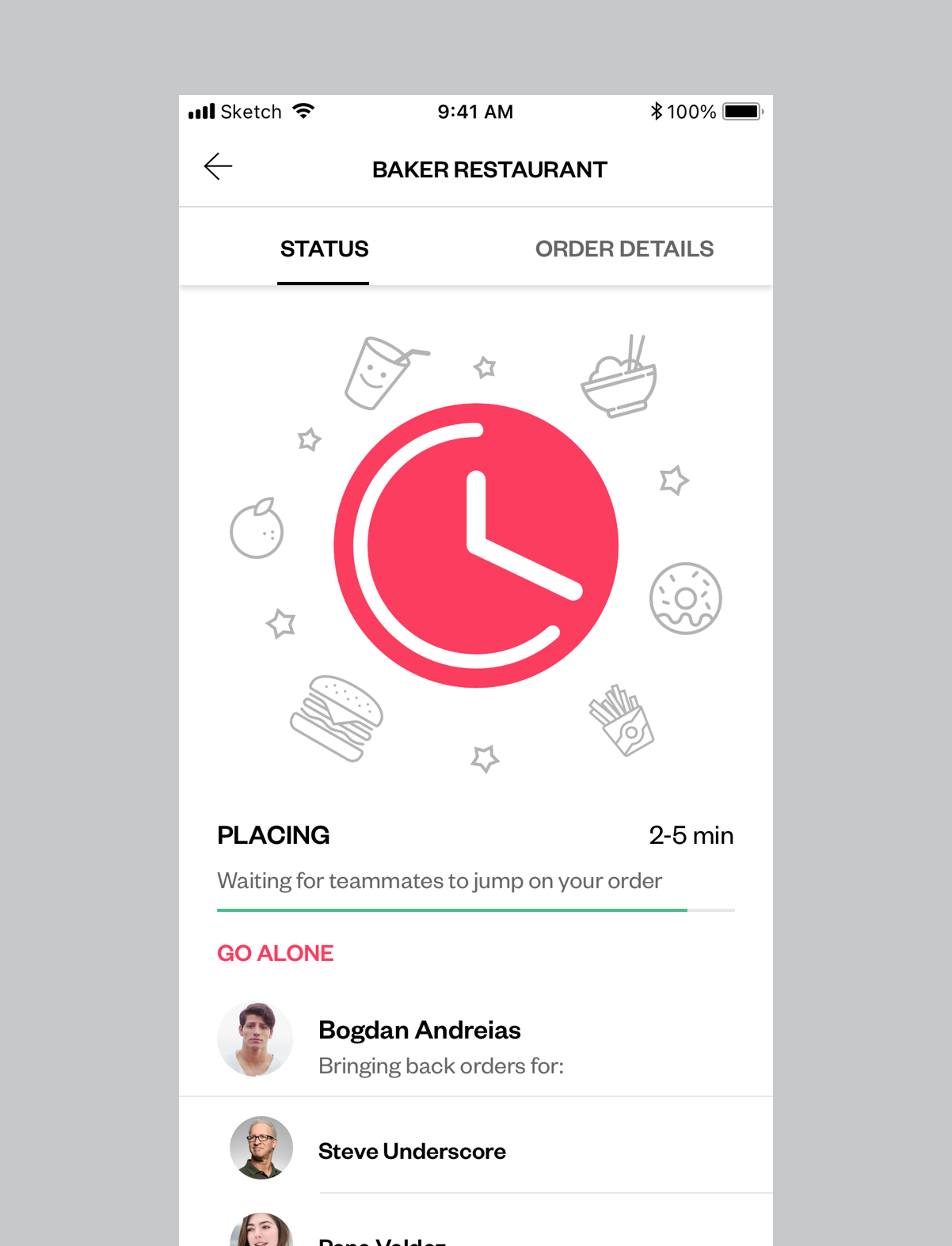
We’ve added scheduled delivery, reshaped group ordering and aligned every component to reflect the new look.
